Documentation
Documentation Menu
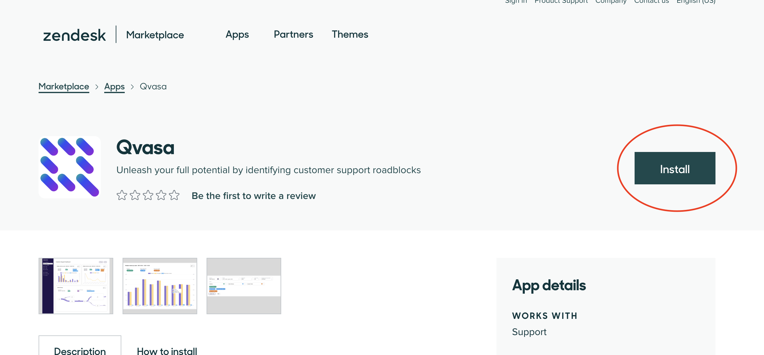
Installing our Zendesk App
Navigate to our app on the Zendesk App Marketplace
A Zendesk Admin is required to install the app.
How to Ensure the Zendesk App Installed Correctly
Navigate to your Zendesk Admin Center under Apps & Integrations -> Webhooks - https://YOUR_DOMAIN.zendesk.com/admin/apps-integrations/webhooks/webhooks
You should then see a webhook with the name qvasa_webhook
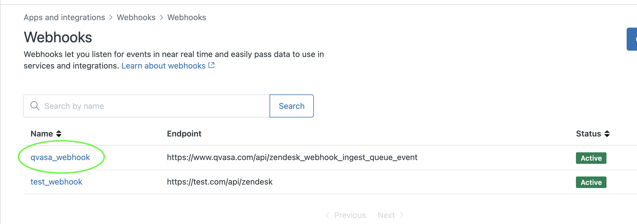
If you dont see the webhook then the app did not install correctly. As a Zendesk Admin:
- Navigate to your Zendesk Dashboard - https://YOUR_DOMAIN.zendesk.com/agent/dashboard
- Wait 2 minutes for the app to install (this is unfortunate - we know)
- Check again.